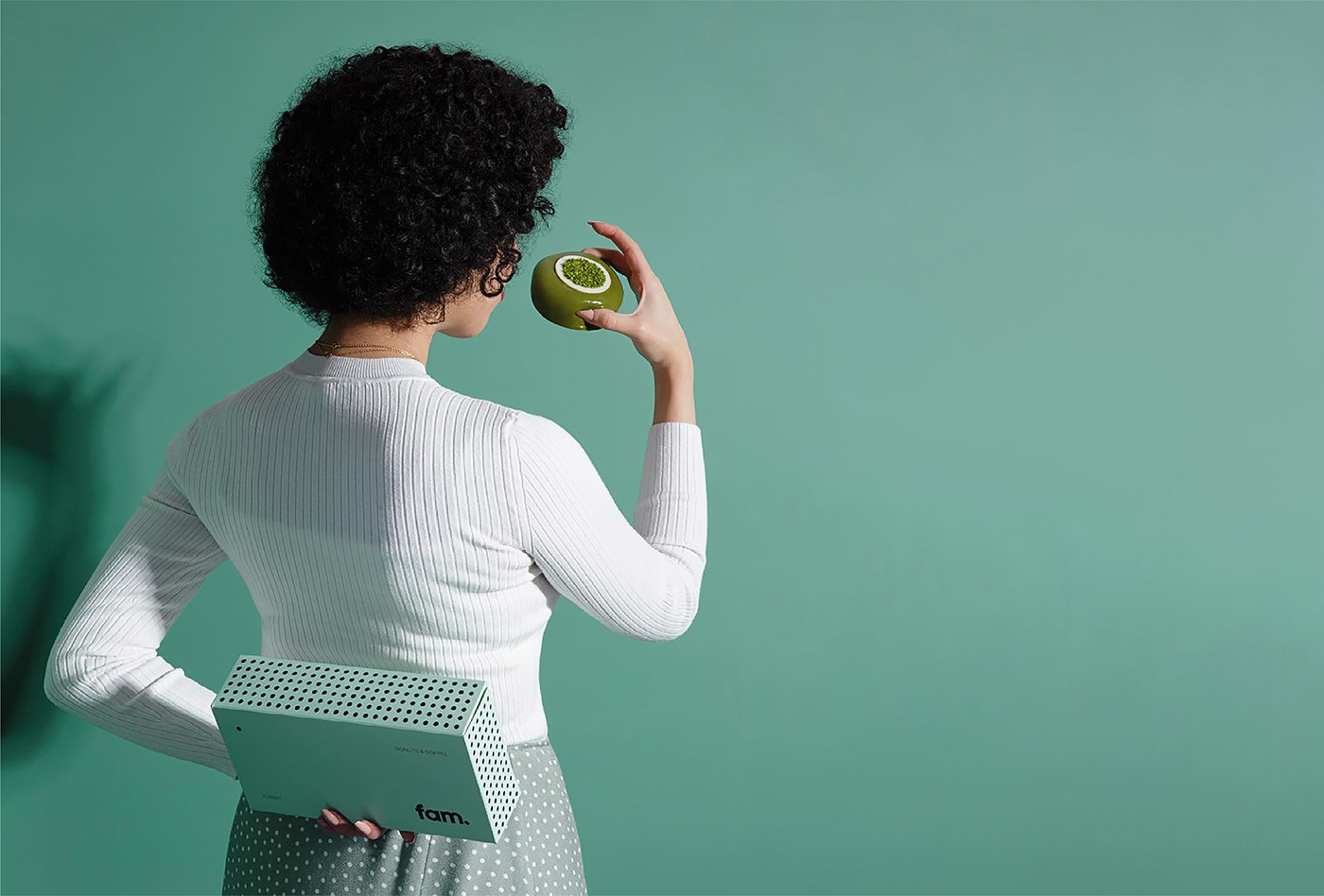
FAM委托Fagerstrom为其新品牌开发品牌策略,视觉标识和包装设计,因为他们想通过一个有趣,积极和充满活力的品牌向消费者传达该公司将其投入其产品的热情和奉献精神,所有这些都是基于极简主义和简单性的价值。
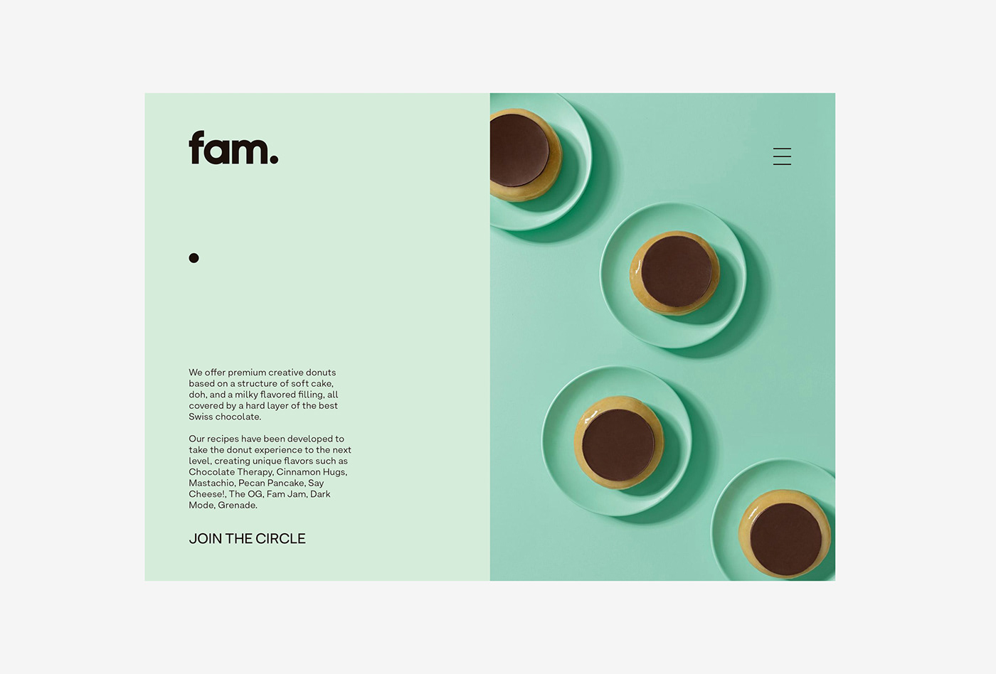
FAM是一个新品牌,提供优质的创意甜甜圈,目的是将全新的甜甜圈概念带给消费者,提供新的口味,优质食材和出色的产品。
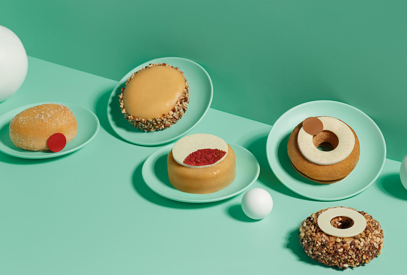
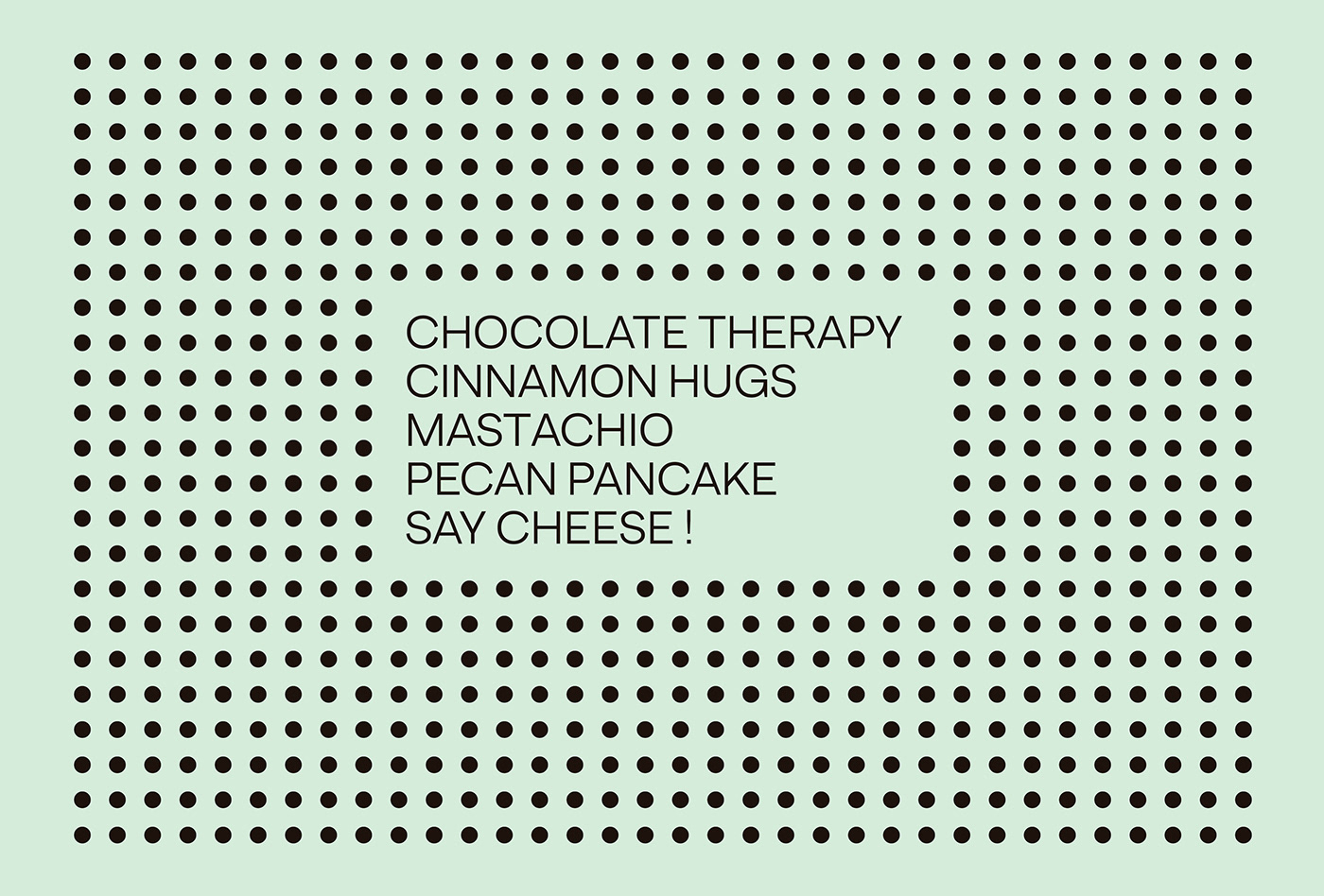
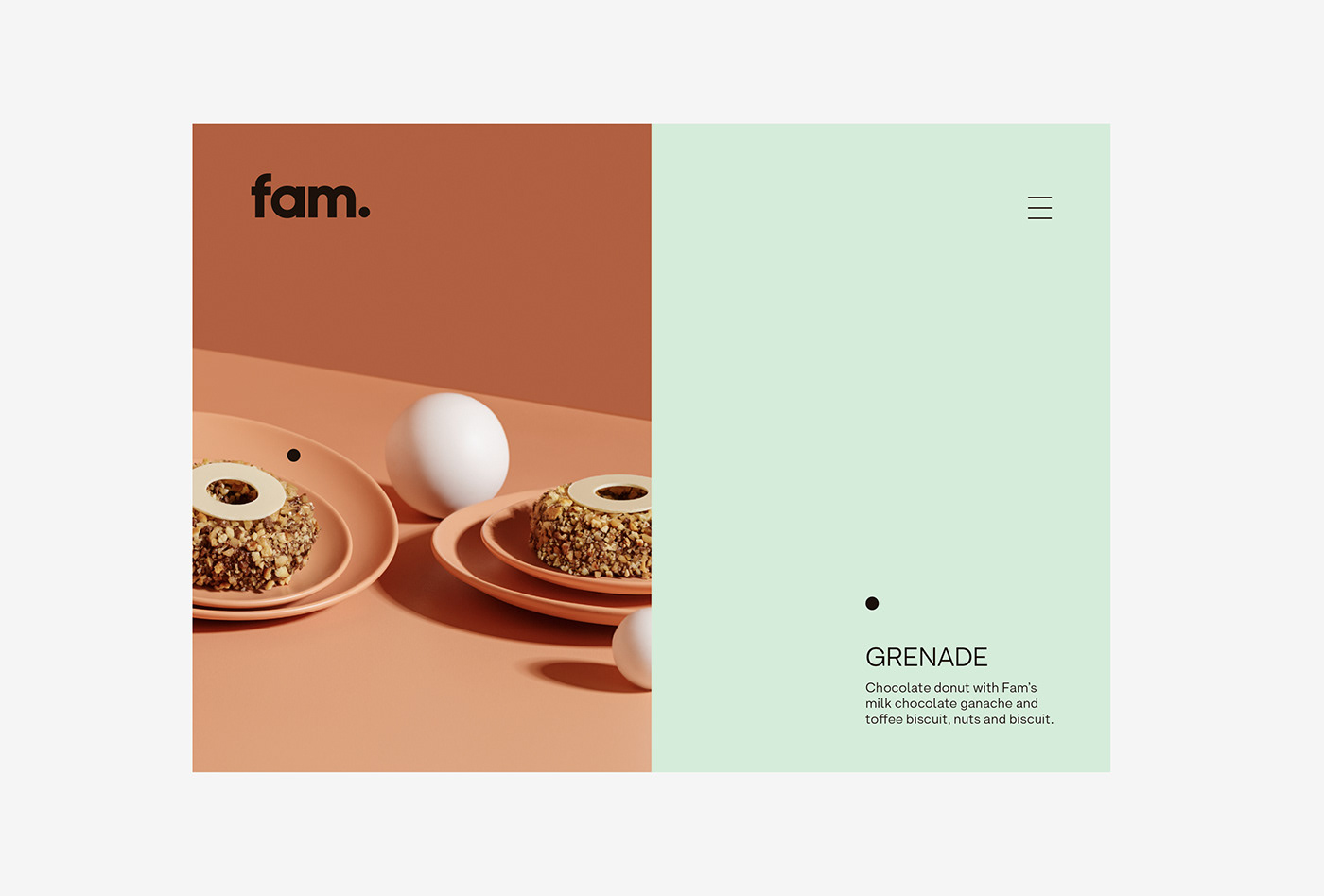
他们的食谱基于软蛋糕,DOH和乳白色的馅料的结构,所有这些都被*的瑞士巧克力覆盖。已经开发了Fam Donuts将甜甜圈的体验提升到一个新的水平,从而创建了独特的口味,例如巧克力*,肉桂拥抱,Mastachio,Pecan Pancake,例如奶酪!,OG,OG,Fam Jam,Dark Mode和Grenade。
“ fam”这个名字是对“Family”一词的缩写,不仅将这个概念理解为亲情,而且是与一个人之间有着亲密和亲切关系的所有人。
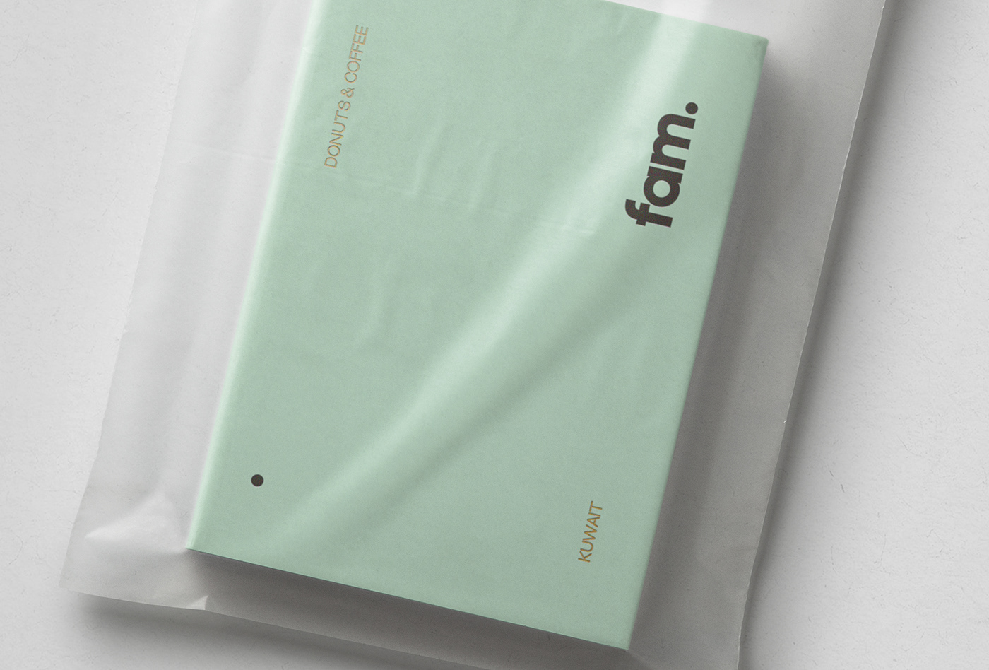
该徽标试图通过使用小写版本中的粗体字体来与产品直接连接,但与此同时,它想要区分自己与圆形边缘字体,因此在此类别中过度使用,并添加了触摸优雅和更*的外观。
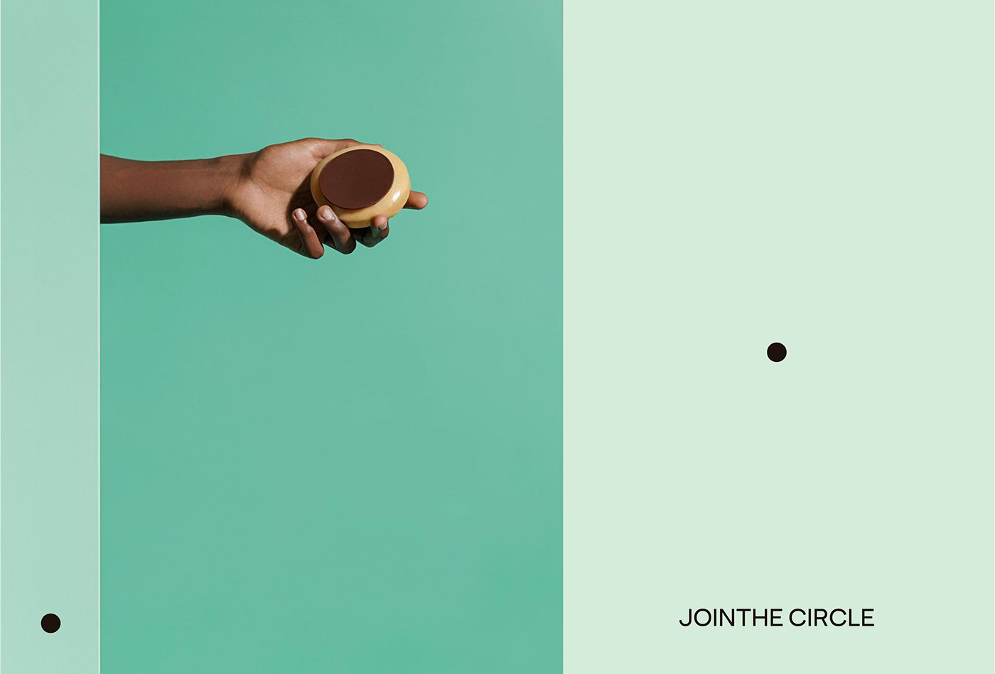
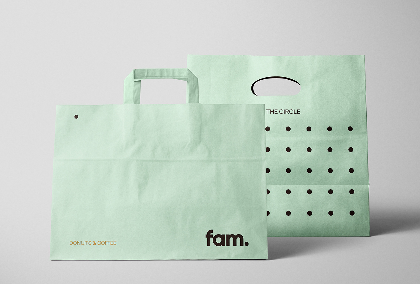
Fam commissioned fagerstrom.studio to develop the brand strategy, visual identity and packaging design for their new brand, because they wanted to convey to consumers the passion and dedication that the company puts into its product, through a fun, positive and energetic brand, all based on the values of minimalism and simplicity.
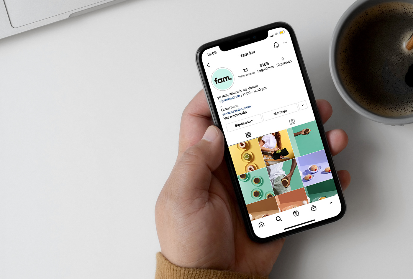
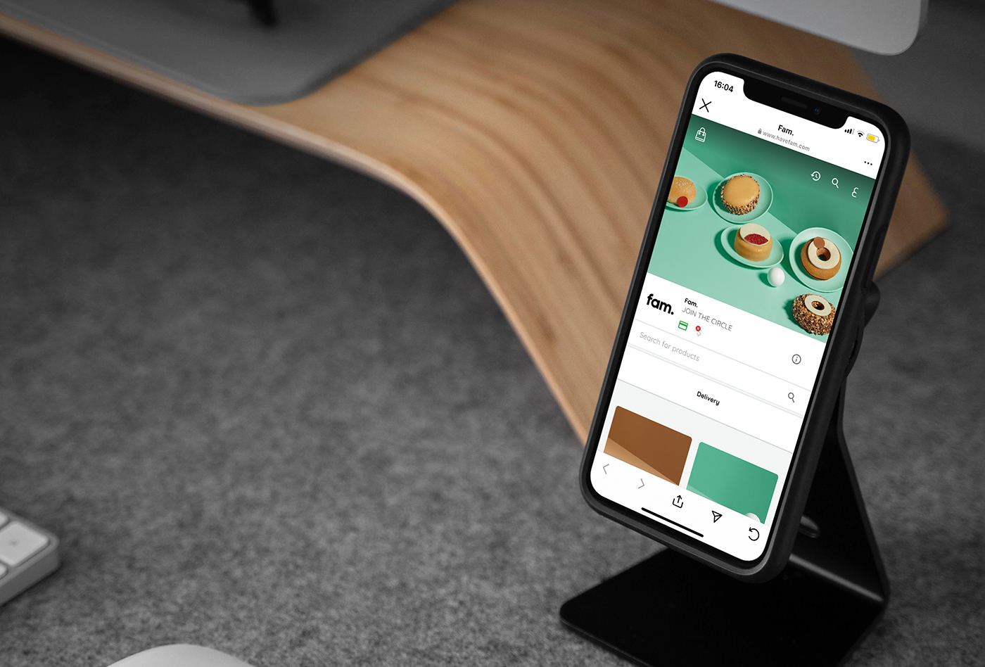
Fam is a new company from Kuwait that offers premium creative donuts with the aim of bringing a totally new donut concept to the GCC countries, offering new flavors, premium ingredients and exceptional product design.
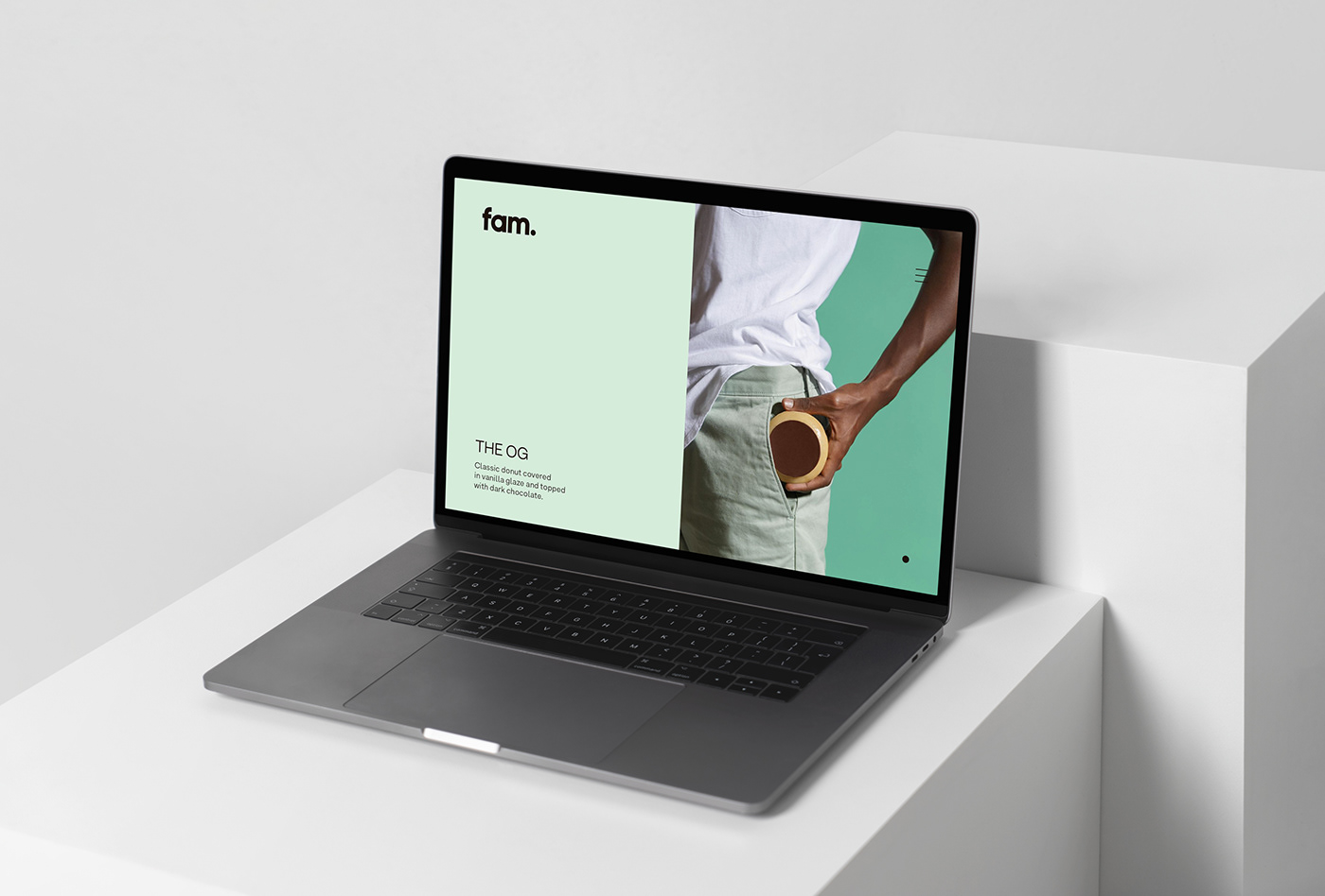
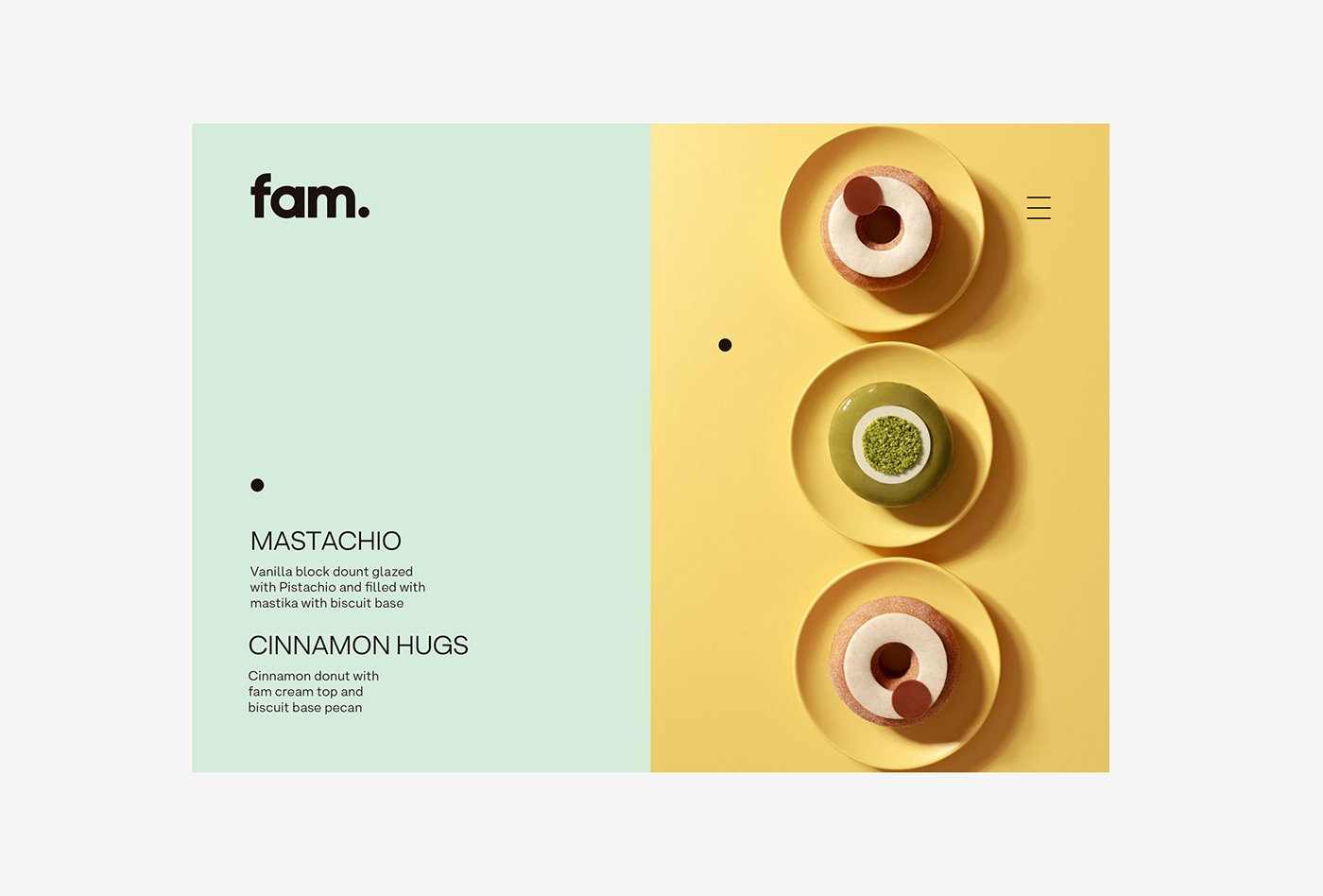
Their recipes are based on a structure of soft cake, doh, and a milky flavored filling, all covered by a hard layer of the best Swiss chocolate. Fam donuts have been developed to take the donut experience to the next level, creating unique flavors such as Chocolate Therapy, Cinnamon Hugs, Mastachio, Pecan Pancake, Say Cheese!, The OG, Fam Jam, Dark Mode and Grenade.
The name 'Fam’ is an abbreviation of the word 'family', understanding this concept not only as biological relatives, but as all the people with whom a person has a close and affectionate relationship.
The logo seeks to generate a direct connection with the product, through the use of a bold typeface in its lowercase version, but at the same time it wants to differentiate itself from the rounded-edge typefaces, so overused in this category, adding a touch of elegance and a more premium look.
*文内出现的文字、图片、知识版权属于其合法持有人。若无意侵犯您的合法权益,请及时联系我们处理。